How to Read a Histogram: Unlocking Data Insights
Understanding Histograms: The Foundations
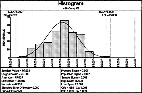
Histograms are crucial tools in data visualization, helping users to understand data distribution patterns at a glance. They provide a graphical representation of **frequency distribution**, often using bars to indicate the number of observations within specified ranges, known as bins. In essence, a histogram allows for a clear interpretation of the underlying structure within a data set. To truly grasp how **to read a histogram**, one must recognize its fundamental elements and how they relate to your data. This understanding is key in executing histogram analysis efficiently and enables better decision-making when interpreting data insights.
What is a Histogram?
A **histogram** is a specific type of bar chart that displays the frequency of certain ranges of data. Each bar’s height indicates how many values fall into each range. By visualizing your data in this way, you can quickly see the overall shape and spread of your data distribution. For instance, when analyzing test scores for a classroom, you could use **histogram tools** to create a visual snapshot that highlights how many students fell into different score brackets. This not only simplifies complex data but also makes it easier to communicate findings, showing visual data analysis in action.
Key Components of Histograms
Understanding the basic components of histograms is essential for precise interpretation. Important features include the **bin sizes**, which must be appropriately chosen to reveal accurate patterns without omitting crucial information. Too few bins can blur differences, while too many may create noise. Thus, **histogram construction** is fundamental when creating a histogram. A well-constructed histogram effectively reveals patterns and insights, such as skewness and modality, allowing for deeper analysis and comprehension of statistical behaviors.
Creating a Histogram: A Step-by-Step Guide
Creating a histogram is simpler than one might think. Whether you are utilizing spreadsheet software or specialized **data analysis tools**, the steps are largely consistent. Follow these key steps to ensure effective histogram representation:
- Determine Your Data Set: Ensure you have a clear focus on the data set you wish to analyze.
- Choose Your Bins: Align your data into appropriate intervals, which are vital for visual clarity.
- Count the Frequencies: Calculate how many data points fall within each bin range.
- Draw the Histogram: Set up the axes and plot bars based on the frequency counts.
Following this process ensures you are not only creating a **histogram chart** effectively but also making it an insightful representation of data distributions. Moreover, software for histograms often comes equipped with advanced features that can automate parts of this process, making it even easier to generate insightful views of your data.
Using Software to Create Histograms
Many software options are available for histogram creation, such as Microsoft Excel, R, Python libraries, and other dedicated statistical tools. Depending on the complexity of your data, these platforms can automate much of the **histogram creation process** and allow for customization of bin sizes and chart aesthetics. Moreover, interactive features can help you explore your data trio more dynamically, revealing rich insights that simpler methods may not uncover. Learning to navigate these software tools effectively can heighten your data visualization capability significantly.
Factors to Consider in Histogram Design
The design of your histogram affects how easily viewers can glean essential insights. Be mindful of color, labels, and axis scales when creating your histogram to ensure clear communication of the underlying data. Variability in bar height can communicate disparities or trends within the data clearly. Additionally, consider integrating features such as cumulative frequency overlaid on the **histogram frequency** bars, offering deeper insight while maintaining clarity. The design choices can enhance or detract from your audience’s ability to understand **histogram insights** effectively.
Interpreting Histogram Shapes and Patterns
Understanding how to interpret the shapes and patterns seen in histograms can yield substantial insights. Shapes such as normal distributions, bimodal distributions, or skewed distributions provide immediate visual hints about the behavior of your data. Recognizing these common **data distribution shapes** not only enhances **histogram interpretation** but also enriches statistical analysis, enabling data-driven decisions. By deeply analyzing these shapes, one can derive important conclusions about central tendencies, variability, and even outliers in the data.
Analyzing Histogram Patterns
Identifying patterns within a histogram involves looking at specific characteristics such as peaks, tails, and gaps. For instance, a normal distribution, characterized by a bell-shaped curve, indicates a highly predictable data set, often seen in data sets governed by standard processes. Conversely, irregular shapes can indicate variability and anomalies in your data that warrant further examination besides just viewing averages. This aspect of **statistical histograms** can lead to profound insights, helping analysts to adjust processes or strategy as necessary.
Colors and Additional Features in Histograms
Utilizing colors and additional visual features, such as annotations or grid lines, can help in highlighting significant data points and aiding interpretation. For example, color-coding certain bins can draw attention to critical thresholds or patterns that need addressing. Additionally, interactive histograms that allow viewers to hover over bars to explore details further elevate the effectiveness of the analysis. Learning how to make the best use of these visual tools can deepen your audience’s comprehension of complex data sets and enhance decision-making abilities.
Examples and Use Cases of Histograms
Real-life applications of histograms can be observed across fields, from business and finance to healthcare and education. For instance, a **histogram example** in finance could illustrate the distribution of stock prices over a particular period, providing insights into price volatility. In education, histograms can represent student performance on assessments to inform instructional practices. By evaluating how data is distributed and identifying trends, stakeholders can make informed decisions that drive success and innovation.
Case Study: Histogram in Action
Consider a university analyzing student grades in a midterm exam across several courses. By tabulating grades and converting these numbers into a histogram, the faculty can swiftly determine the grade distribution. For example, if a majority of students clustered around the lower bin ranges, earlier interventions could be considered to improve teaching strategies before final exams. This scenario demonstrates the value of **reading histogram data** effectively, translating numbers into actionable insights.
Limitations of Histograms
Though histograms are effective, they are not without limitations. They mask individual data points by aggregating them into bins, which can lead to missing critical nuances within data trends. Furthermore, improper **bin sizes in histograms** can skew interpretations, generating potentially misleading visuals. Understanding these limitations is crucial; analysts should thoughtfully complement histogram insights with other forms of data representation to cover these gaps holistically. Balancing different visual and statistical tools can safeguard against unwarranted conclusions.
Key Takeaways
- Histograms present essential visualizations that simplify the understanding of frequency distributions.
- Creating and interpreting histograms involves careful attention to binning strategies and structural elements.
- Recognizing patterns within histogram representations can lead to innovative strategies and decisions through informed analysis.
- Real-world applications highlight the versatility of histograms in numerous industries.
- While powerful, it’s important to be aware of and address the limitations when reading histograms.
FAQ
1. What is the definition of a histogram?
A histogram is a visual representation of the frequency distribution of data points within defined intervals or bins. It employs bars to show how many observations fall within each bin, allowing viewers to discern patterns and insights quickly.
2. How do you determine the right bin size for a histogram?
The right bin size can be determined by the nature of your data, sample size, and the objective of your analysis. A common practice is the square root of the number of data points, although tools often provide options for optimizing bin sizes based on distribution shape.
3. What are the advantages of using histograms?
Histograms offer several advantages, including a clear overview of the data distribution, quick visualization of data trends, and ease of communication with stakeholders. They simplify complex data sets, enabling informed decision-making based on visual insights.
4. Can histograms reveal outliers?
Yes, histograms can potentially highlight outliers in a data set, often represented by bars that fall significantly isolated from the majority. Analyzing these extremes can provide critical insights into variations that may need investigation.
5. How can I create a histogram using Excel?
To create a histogram in Excel, prepare your data in one column. Select the “Insert” tab, choose “Histogram” from the “Charts” group, and adjust the bin range as needed. Excel will automatically create a histogram based on your data, allowing for easy customization.
6. What are the limitations of histogram interpretation?
Histograms can obscure individual data points, as they depict aggregated information. Additionally, poorly chosen bin sizes can lead to misinterpretation. It’s essential to complement histogram insights with other statistical methods and visualizations for comprehensive analysis.
7. How are histograms used in business analytics?
In business analytics, histograms are utilized to assess sales data, customer feedback, operational metrics, and performance benchmarks. They help in visualizing trends, identifying problematic areas, and informing strategic decisions that optimize processes and outcomes.